Remove Touch Overlay
Data Analysis Using Seaborn - Scatter Plot | Python | Part 3
Duration: 02:39Views: 333Likes: 2Date Created: Nov, 2021
Channel: TechieNet
Category: Science & Technology
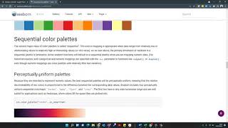
Description: I tried to show the multi Dimensionality in seaborn Visualization in columns instead of Colourizing and also I showed how to change the colour of your own choice from the colour palette. link: seaborn.pydata.org/generated/seaborn.color_palette.html#seaborn.color_palette A scatter plot uses dots to represent values for two different numeric variables. The position of each dot on the horizontal and vertical axis indicates values for an individual data point. Scatter plots are used to observe relationships between variables. #pyhton #seaborn #dataanalysis #datascience #scatter plot #relplot
Swipe Gestures On Overlay


Items shown
to: 10
of:999